

Wayidem Engineering website redesign
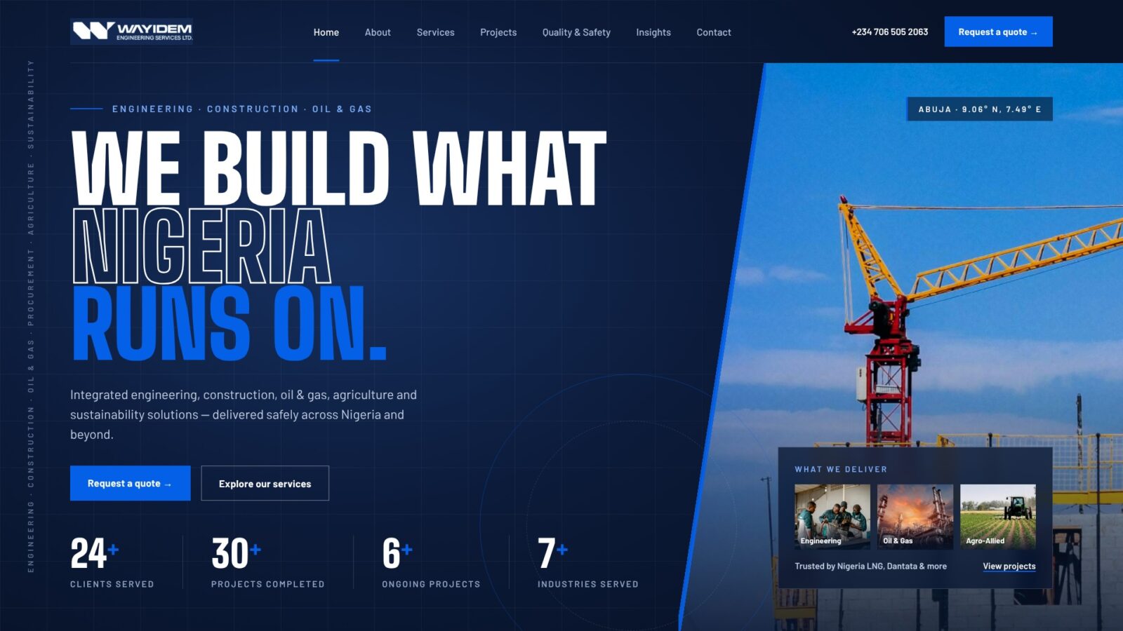
An audit and homepage redesign for an Abuja engineering, construction and oil & gas contractor: a bold, responsive page that leads with proof, keeps the brand's own blue and turns visitors into quote requests.
- Client
- Wayidem Engineering Services Ltd, Abuja
- Sector
- Engineering, construction, oil and gas
- Role & scope
- Site audit, redesign strategy, homepage design and build
- Status
- Homepage delivered
Project overview
An audit and homepage redesign for an Abuja engineering, construction and oil & gas contractor: a bold, responsive page that leads with proof, keeps the brand's own blue and turns visitors into quote requests.
Technologies used
Client & context
Wayidem works across six service lines: engineering, construction and infrastructure, oil and gas, procurement and supply, agriculture and agro-allied, and sustainability. Its clients include Nigeria LNG, Dantata, Cannon Projects, Zephyrgold, ETCO, 7 Fifteen Capital, Royal Niger Properties and 3-Tee Unico.
The company already had a WordPress site built with Elementor. It worked, but it read like a filled-in template. For a contractor bidding on industrial and infrastructure work, the website is often the first due-diligence check a procurement officer makes, so it needed to look as credible as the company's client list.
The problem
The site had good ingredients but failed on proof and polish. My audit found issues in four areas:
- Broken first impressions. The four stat counters rendered as "0+" before JavaScript ran, so Google and every WhatsApp, LinkedIn and X link preview showed "Clients Served 0+". An "Our History" heading sat empty above the About section.
- Technical SEO errors. The X meta tag read
@https://x.com/WayidemOfficialinstead of@WayidemOfficial, the browser and social titles didn't match, a footer link pointed to#, and one image was still named "ChatGPT-Image-Feb-17…". - Generic messaging. Copy such as "world-class", "tailored" and "Engineering Excellence Since Inception" could describe any competitor, and stock photography weakened trust.
- Weak conversion. There was a single contact route, with no quote form, no WhatsApp button and no clear path from interest to enquiry.
Objectives
- Build credibility fast. Put real proof (clients, numbers, safety commitments) in front of visitors within the first scroll.
- Look modern and confident. Replace the template feel with a bold, distinctive visual identity that still belongs to Wayidem.
- Turn interest into enquiries. Give visitors clear routes to act: a quote form, WhatsApp and click-to-call.
- Work everywhere. Design mobile-first for Nigerian users on phones and slower networks.
- Fix the foundations. Correct the SEO and metadata errors, and add structured data so search engines understand the business.
- Publish only what's true. Use no invented stats, projects or certifications.
Discovery & strategy
I began with a structured audit of the live homepage and its source. I checked the content, the metadata, the image assets, how link previews render, and how the page behaves without JavaScript. I scored six areas out of 10: first impression 5, messaging 4, trust 5, conversion 4, technical SEO 5, and mobile/performance unverified.
Audience. The primary visitor is a procurement officer or project lead at an oil and gas company, developer or government agency. They scan for evidence before they read, and they want to know quickly: who has this company worked for, can it deliver safely, and how do I get a quote?
Strategy. Lead with evidence, not adjectives:
- Group the six services so the company reads as focused, not "we do everything".
- Show the client logos immediately after the hero.
- Replace marketing claims with verifiable facts, and leave out anything that can't be confirmed.
- Make the quote request the main call to action across the page.
- Recommend a fuller sitemap for later phases: individual service pages, a filterable project portfolio, HSE and certifications, and careers with a fraud notice.
Design direction
The final direction draws on Nigerian construction-site signboards: big, condensed, confident type over large solid colour fields and real site photography. I got there in three rounds:
- "Industrial Precision" concept. A navy-and-safety-orange design with blueprint motifs and illustrated scenes. It established the page structure, but the client felt it looked like a mockup, not a real website.
- Bolder, real-site version. I rebuilt the page as working HTML, with a construction-yellow and navy palette, real photography from the client's media library and no placeholders.
- Brand alignment. I matched the colours to the existing site, sampling them from a full-page screenshot, so the redesign feels like an evolution of Wayidem rather than a new brand.
| Element | Choice | Why |
|---|---|---|
| Primary blue | #0460E7 | The site's existing button blue, used for the hero, quote section and calls to action |
| Navy | #142952 | The site's existing navy, used for the header, safety section and footer |
| Surface | #EDF2FA pale blue-grey | Softens long sections and sits naturally beside both blues |
| Display type | Big Shoulders Display | Tall, condensed and industrial; makes headlines feel like site signage |
| Body type | Barlow | Rooted in highway signage; clear at small sizes |
| Motif | Blue-and-navy hazard stripe | A single nod to site safety tape, above the Quality & Safety section |
User experience decisions
Every section answers one question a procurement visitor asks, in the order they ask it.
- Hero: "What do you do?" A full-height blue panel with the headline "We build what Nigeria runs on.", the company's own one-line summary, and two clear actions: Request a quote and Explore our services.
- Client logos: "Who trusts you?" All eight client logos sit directly under the hero, grey by default so they don't compete with the content, and in full colour on hover.
- Services: "Can you handle my project?" Six services as an interactive list. Clicking one opens its description and swaps the large photo beside it, so the section stays compact without hiding content.
- About and stats: "Are you established?" The real figures from the live site: 24+ clients, 30+ projects completed, 6+ ongoing projects and 7+ industries.
- Process: "What happens if I hire you?" Five steps, from Consult to Maintain, so buyers can picture the engagement.
- Quality and safety: "Will you deliver safely?" The four commitments from the original site, given their own dark section.
- Quote section: "How do I start?" A validated form with service and location fields, plus phone, email, address and a WhatsApp button. A floating WhatsApp button stays on screen throughout, because WhatsApp is how much Nigerian business starts.
Accessibility was built in, not added later: a skip-to-content link, visible keyboard focus, labelled form fields with clear error messages, a 52px minimum touch target, sufficient colour contrast, and animation that switches off for users who prefer reduced motion.
Development & implementation
I hand-coded the homepage as a single self-contained HTML file, with no framework and no page builder, so it is light, fast and easy to drop into the existing WordPress site.
- Responsive layout. CSS Grid and Flexbox with three breakpoints (1100px, 920px, 600px), fluid type sizes, and safe-area padding for notched phones.
- Interactivity. A few lines of vanilla JavaScript for the mobile menu, the services accordion with image swap, and form validation.
- Quote form. It validates required fields and email format, then opens the visitor's email app with the request pre-filled. It's ready to connect to WPForms, Formspree or Elementor Forms for direct submissions.
- SEO. A rewritten page title and meta description, a corrected X handle, Open Graph tags, and LocalBusiness structured data with the address, phones, email and social profiles.
- Performance. Lazy-loaded images below the fold, a high-priority hero image, and font preconnects.
- Deployment. The page can go into an Elementor HTML widget on a blank "Elementor Canvas" template, or be converted into a theme page template. A shareable live preview, with images embedded, let the client review it outside their own domain.
Outcomes
- All four audit-level errors fixed: the zeroed counters, the empty heading, the broken X tag and the mismatched titles.
- A homepage that leads with real proof: eight client logos and four verified stats in the first sections.
- Three routes to enquire, up from one: a quote form, WhatsApp and click-to-call.
- Fully responsive from 320px phones to wide desktops, with built-in accessibility support.
- A phased roadmap for the rest of the site: individual service pages, project case studies, HSE and certifications, and careers.
None yet. These are the measures that will be reported after launch:
- Quote requests per month, before and after launch
- Mobile page speed (Largest Contentful Paint target: under 2.5s on 4G)
- Search ranking for "engineering company Abuja" and related terms
- Client feedback on the redesign
Lessons learned
- Show the real thing early. The first concept was well structured, but a mockup with drawn illustrations didn't feel real to the client. Moving to working HTML with real photos changed the conversation immediately.
- Keep the brand's equity. A bold new palette looked striking, but bringing back the site's own blue and navy made the redesign feel like Wayidem, not a stranger.
- Empty is better than invented. Placeholder brackets read as unfinished, and invented numbers erode trust. The fix was to use only facts the client had already published.
- Check what crawlers see, not just what people see. The "0+" counter bug was invisible in a browser but showed in every shared link, which is where many Nigerian B2B leads first see a company.
- Plan for where images live. Hotlinked photos work on the client's domain but not in third-party previews, so client-review links need embedded assets.
Planning something similar?
Tell me about your project and I will share how I would approach it.