

GTpave IPW 2027 event website
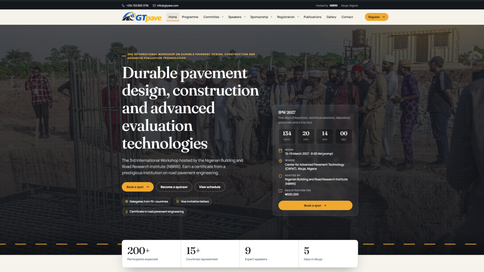
A custom WordPress theme that turned a thin page-builder event site into a full registration platform for NBRRI's International Pavement Workshop: programme, speakers, naira or dollar payment, visa letters and receipt uploads.
- Client
- Nigerian Building and Road Research Institute (NBRRI), GTpave
- Sector
- Research institute, international event
- Role & scope
- UX and visual design, front-end and WordPress development, content migration, QA
- Status
- Built and tested, awaiting launch
- Year
- 2026
Project overview
A custom WordPress theme that turned a thin page-builder event site into a full registration platform for NBRRI's International Pavement Workshop: programme, speakers, naira or dollar payment, visa letters and receipt uploads.
Technologies used
Client & context
The International Pavement Workshop (IPW) is NBRRI's annual capacity-building event on road pavement engineering. Previous editions (IPW 1.0 and 2.0) brought together researchers and practitioners from Nigeria, the Netherlands (TU Delft) and Canada. The 2027 edition, the 3rd International Workshop on Durable Pavement Design, Construction and Advanced Evaluation Technologies, runs for five days, 15–19 March 2027, at the Center for Advanced Pavement Technology (CAPaT) in Jabi, Abuja, with a ₦500,000 registration fee and a certificate for every delegate.
The website has three audiences with different jobs to do:
- Delegates: engineers, academics and agency staff who need dates, fees, the programme and a way to register and pay, often from outside Nigeria.
- Sponsors and partners: companies that want to know what each package buys and how to sign up.
- The organising committee: a small team that has to collect registrations, chase payments, issue visa letters and keep the site current without a developer.
The problem
The old gtpave.com looked like an event site but could not do an event site's main job: take a delegate from interest to a paid registration.
- Empty key pages. Programme, Speakers, Committee and Sponsorship pages had a title and no content.
- A registration dead end. The registration page listed what the fee included but not the fee itself. The form asked for a name and an upload, then showed one naira bank account, with no reference number, confirmation or path for international delegates.
- No help for foreign delegates. Nothing about visa invitation letters, and no way to pay in dollars.
- Heavy and fragile. It was built with Elementor plus plugins for sliders, cookies and PDF flipbooks. The 29 papers loaded as 29 embedded third-party viewers on one page. A short burst of page requests during my audit made the shared host return "Error establishing a database connection".
- Hard to keep current. Speakers were separate builder pages and partners were unlabelled logo images, so every change meant editing layouts by hand.
Objectives
- Make registration complete end to end: fee, details, travel needs, payment instructions, a reference number and proof-of-payment upload in one flow.
- Serve international delegates: a choice of naira or US dollars with a separate account for each, and visa invitation letter requests.
- Fill every page with real content: programme, speakers with biographies, both committees, sponsorship packages, 28 papers and two photo galleries.
- Hand the committee control: everything editable from the WordPress dashboard, including dates, fees, accounts, speakers, sessions, partners and papers.
- Give the event a distinct identity that belongs to road engineering rather than a generic conference template.
- Be light and dependable: no page builder, fewer plugins, fast on mobile data in Nigeria.
Discovery & strategy
I started with a page-by-page audit of the live site and a registration page prototype I had already designed, then mapped every piece of content to where it would live in the new build.
| What I found | Decision |
|---|---|
| 14 pages, 8 speaker pages, 29 PDF viewers, 2 photo albums, 9 partner logos | Keep every URL and reuse every file already in the media library; nothing re-uploaded |
| Speakers, committee members, sessions, papers and partners were hand-built layouts | Turn each into its own content type with simple fields, so the committee edits records, not layouts |
| Old speaker addresses like /prof-samson-duna/ were indexed | Move speakers to /speaker/… and redirect the old addresses permanently |
| The fee and payment rules lived in people's heads and a flier | Put dates, fees, exchange rate, bank accounts and contacts in one settings panel |
| The host could not take load | Ship a lean theme: self-hosted fonts, no sliders, no builder, PDFs opened directly |
Midway through, the committee released the official IPW 2027 flier. It changed the dates (to 15–19 March 2027), the length (three days to five), the venue, the fee (₦500,000) and four speakers. Because content and settings were already separated from layout, I could update the whole site from the flier without touching a template, and I wrote a one-time update so sites already running the first version would correct themselves.
Design direction
The visual language comes from the road itself: asphalt, paper specifications and the amber of lane markings. It keeps the serious, academic tone the institute needs while feeling specific to pavement engineering.
| Element | Choice | Why |
|---|---|---|
| Colour | Asphalt ink #14171C, paper #F6F3EC, lane amber #F0A92E | Dark bands for headers and key moments, warm paper for reading, amber reserved for actions |
| Display type | Fraunces, with italic for the event name ("Secure your place at IPW 2027") | Gives an institutional, editorial voice to headlines |
| Text type | Manrope | Clear at small sizes on low-end phones |
| Motif | Dashed amber lane line; a slow "driving" centre line in the home hero | Ties the brand to roads without stock imagery |
| Components | Rounded cards, pill buttons, dark summary panels | One consistent kit across 13 page layouts |
I followed the registration prototype closely so the checkout and the rest of the site read as one product. Both fonts are self-hosted, which keeps pages fast and avoids sending visitors' data to a third-party font service.
User experience decisions
The registration page does most of the work, so most of the decisions are there. It runs as four steps on one page, with a live order summary beside it:
- Choose your ticket: the fee and what it covers, and the currency you will pay in (naira or US dollars).
- Your details: name as on the passport (used for the badge, certificate and letter), organisation, contact.
- Travel and needs: visa letter request with nationality and travel dates, meals, accessibility.
- Review and pay: card, bank transfer or invoice; the matching bank account appears in place.
- One page, not a wizard. Delegates can scroll back and see everything they entered; the summary panel (a sticky bar on phones) always shows the total.
- Currency is a choice, not a conversion. Delegates pick naira or dollars, see prices in that currency only, and get that currency's account. The dollar option stays hidden until the domiciliary account is filled in, so nobody sees placeholder bank details.
- A real ending. Submitting gives a reference number (for example IPW27-XXXXXX), the exact amount due, the account to pay into, a receipt upload and an email copy.
- Safety signals. The form never asks for card or passport numbers, and says so; passport copies are requested later through a secure link.
- Errors that help. Fields are checked before sending, every problem is listed at the top and next to the field, and focus moves to the first one.
Across the rest of the site, committees show the chair and co-chair together in a dark band with members in light cards below; publications became a searchable, filterable list of 28 papers that open as plain PDFs; sponsorship shows three packages, a full comparison table and a four-step path from enquiry to exhibition stand; and menus, tabs and the gallery viewer all work from the keyboard, with reduced motion respected.
Development & implementation
I built a custom WordPress theme with no page builder, delivered as a single zip the client uploads under Appearance → Themes.
| Layer | What I built |
|---|---|
| Templates | Home, Programme, Committee overview and members, Speakers and speaker profiles, Sponsorship, packages and sponsor form, Registration and checkout, Publications, Gallery, Contact, plus 404 and search |
| Content types | Speakers, committee members, programme sessions, publications, partners, registrations, enquiries |
| Settings | One "Event settings" panel: dates, start time, venue, fees in naira and dollars, exchange rate, both bank accounts, card payment links, contacts |
| Forms | Delegate registration, receipt upload, sponsorship enquiry and contact; each saves a record in the dashboard and sends emails |
| Admin tools | Registration statuses (awaiting payment, proof uploaded, paid), internal notes, "Export all to CSV", a count of unpaid registrations in the menu |
| Setup | Runs on activation: applies templates to the existing pages, sets the menus and home page, imports speakers, committees, programme, papers and partners from the live site |
- Prices are recalculated on the server, so a delegate cannot change the amount in the browser.
- Every form carries a security token, a hidden spam trap, a minimum fill time and a limit of six submissions per 10 minutes per visitor.
- Receipt uploads must match the registration's email and be a JPG, PNG or PDF under 5 MB.
- CSV exports guard against spreadsheet formula injection.
- Old page-builder content is ignored, so the switch from Elementor does not leave broken layouts.
I tested every page at desktop (1366 px) and phone (390 px) widths and scripted end-to-end runs of registration in both currencies, receipt upload, contact and sponsorship forms. Testing caught, among other things, a mobile menu trapped inside the sticky header and a hero that lost its side margins on phones. The build went through four rounds with the client, ending at version 1.1.2.
Outcomes
- From 4 empty pages to full content: a 5-day provisional programme, 9 speaker profiles, both committees with roles and photos, 3 sponsorship packages, 28 papers and 60 gallery photos.
- A full registration flow where there was only an upload form: reference numbers, naira or dollar payment, visa letter requests, receipt uploads and a dashboard to track who has paid.
- Less to maintain: no page builder, no slider or flipbook plugins; dates, fees and accounts change in one settings panel.
- Same addresses, same files: every original URL still works, and every image and PDF is reused from the existing media library.
None yet. These are the measures that will be reported after launch:
- Number of online registrations and the share paying in dollars
- Share of registrations with a receipt uploaded before the deadline
- Mobile page speed before and after
- Visa letter requests handled through the form
Lessons learned
- Separate content from layout from day one. The flier arrived after the first release and changed dates, length, fee and speakers. Because those lived in settings and records, the update took hours, not a redesign.
- Design for how people actually pay. In Nigeria, an international event needs both naira and dollar accounts. Treating currency as the delegate's choice, with its own account, is clearer than showing converted prices.
- Never show unfinished data in public. Hiding the dollar option until the account details are complete protected trust in the payment step.
- Test the host, not just the design. A shared server that falls over under a burst of requests shapes the build: fewer plugins, lighter pages, no embedded viewers.
- Respect existing URLs and files. Keeping every address and reusing the media library made the switch low-risk for an institution with years of links and indexed pages.
Planning something similar?
Tell me about your project and I will share how I would approach it.